Research, Research, Research — An Architect's Logo
Concept & Strategy: I drew inspiration from the architect’s Chinese family name, stylizing the character 余 to resemble a house—creating a mark that is both memorable and personal. The character was meticulously redrawn and tested for legibility in Chinese while ensuring visual clarity as an illustration.
Nostalgia as a Design Strategy — College Club Logo
Objective: Create a nostalgic logo that resonates with alumni, inspiring them to attend events and support the school. Drawing from the Mills campus' many eucalyptus trees, I incorporated a turning leaf as the organization’s logo mark.


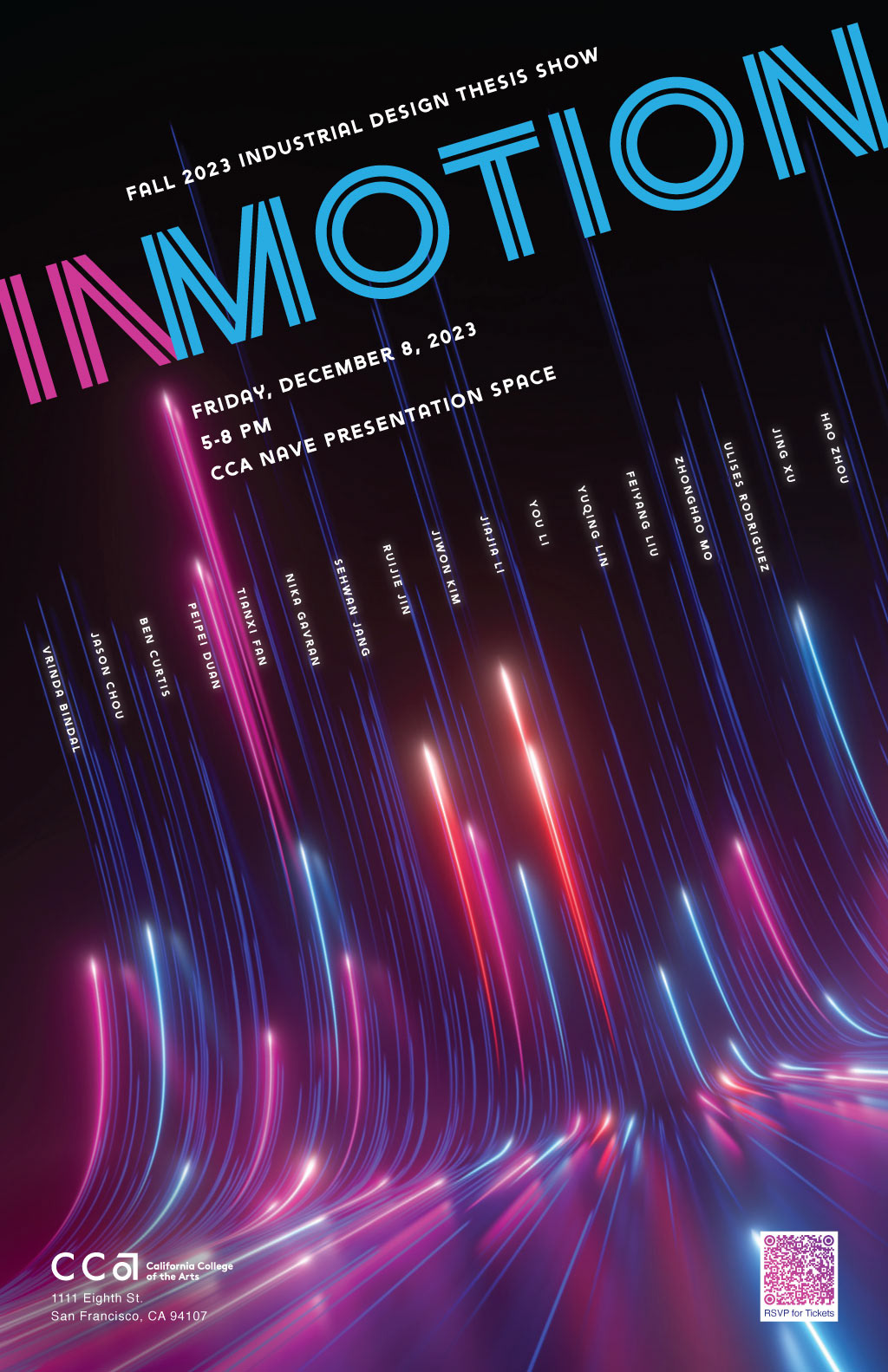
InMotion: California College of the Arts Senior Show Poster
The Challenge: Present all 17 student names with equal hierarchy and clarity, using a unique color palette for the event.
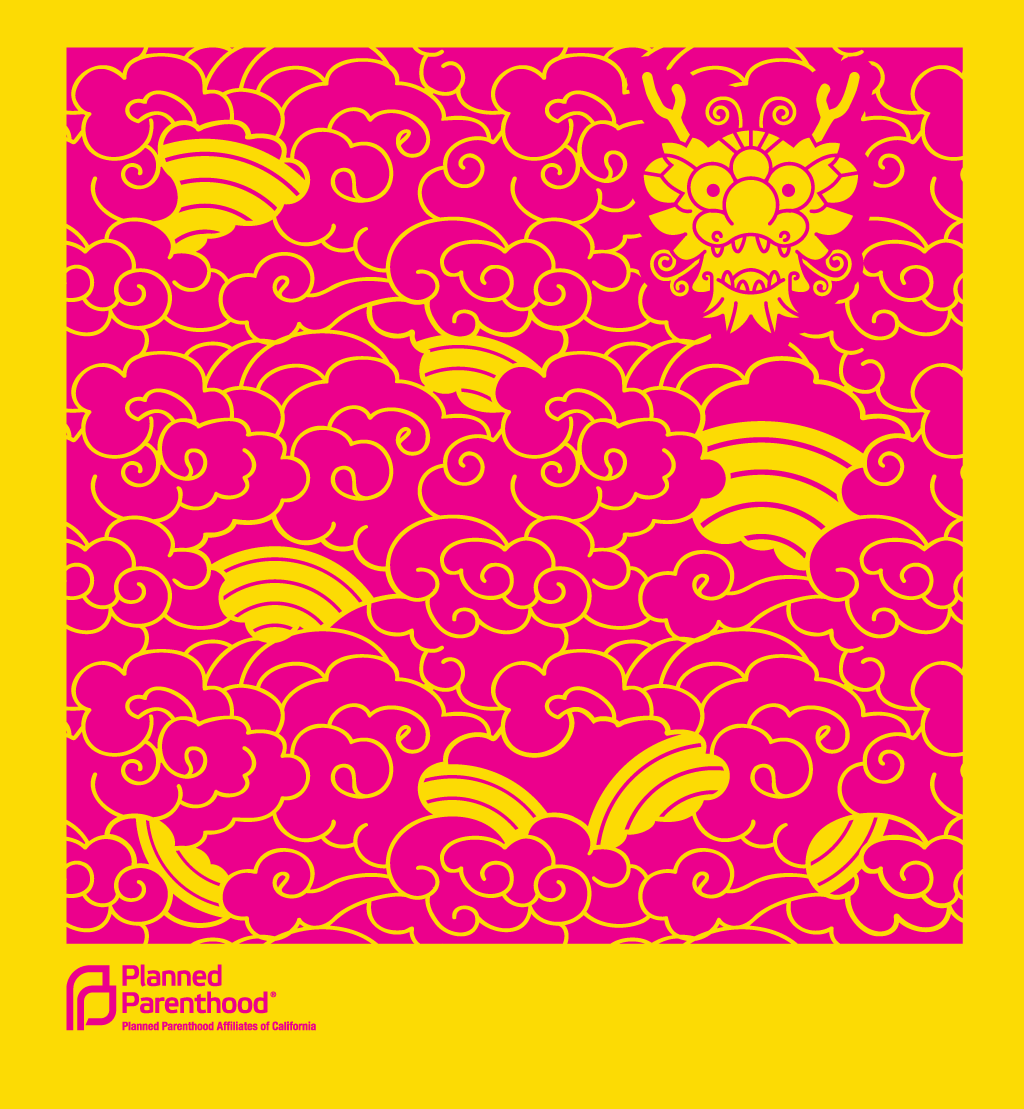
Year of the Dragon T-Shirt, Planned Parenthood of California
Objective: Create a bold, stylish design using a single color to keep printing costs low. A bold color was chosen for the shirt because in Chinese culture, yellow symbolizes royalty, power, earth, and prosperity.
"The Knowledge Café" Book Cover
Design Concept: Stylized typography within a speech bubble formed by the foamy bubbles of a coffee cup, emphasizing the conversational nature of the book’s focus on business success.
T-shirt Design for Sex Workers Outreach Project
Concept & Strategy: Create an interactive, memorable shirt featuring a hidden illustration that gives the wearer control. Designed as a fundraiser, the shirt sold out with each printing.
Photo: Ellis Au, Model: Lisa Wagner
Faceless, Yet Full of Personality: Designing an Expressive Character
Concept & Strategy: At the annual fundraiser, tomato plants are the most popular items for sale, with many varieties available. To balance the formality of the required logotype set by the University of California, I designed a tomato mascot with expressive posture—conveying personality without a face. This lively, playful style was carried over to other design elements, with the tomato appearing in different poses throughout the event materials.
Creative Solutions: Paper Engineering and Design for San Francisco Shopping Center
The Challenge: Develop a piece that showcases the distinctive rotunda and architecture of the downtown shopping mall, aimed at attracting upscale retailers to lease space. I designed a paper pop-up self-mailer that ingeniously holds its shape with just a rubber band, creating a dynamic and engaging reveal.
